The Total Brand and Web Overhaul of an Established Vancouver Institution, complete with Long-Term Design and Development Support
Client: Vancouver Youth Symphony Orchestra
Length of Relationship: Ongoing (6 Years)
Services: Brand Strategy and Execution | Website Design and Development | Print and Digital Season Collateral
Context
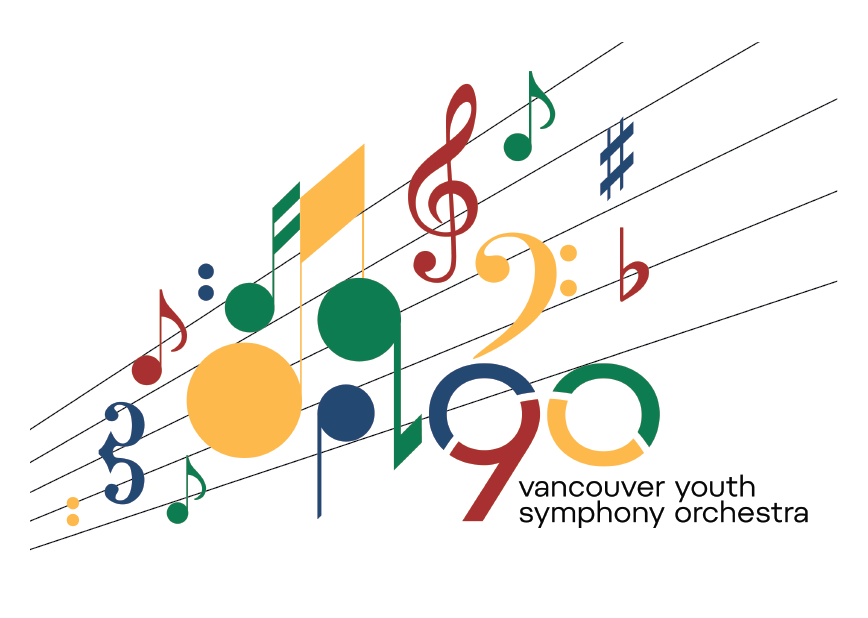
The Vancouver Youth Symphony Orchestra is an established youth orchestra in Vancouver that was coming up in its 90th year at the time of engagement. In advance of that year, they wanted to completely overhaul their brand and web presence, complete with a complex back-end architecture to suit the various requirements of the individual orchestras, sessional instructors, conductors, and students, to alleviate administrative pressure from the organization itself.
Method
The Orchestra is an institution in Vancouver, and as an adolescent musician, I have memories of the players, music, and concerts of the VYSO. I leaned on my nostalgic experience of the Orchestra and dove into experiencing them as a branding and web consultant. I met with key staff and students, attended their shows, evaluated past materials and looked at international colleagues and equals in the youth music scene. I spoke to professional musicians about colours and fonts and what stood out for them as resonant within the culture of classical music and music performance.
Design Process
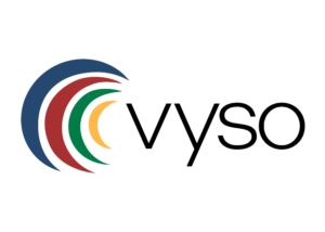
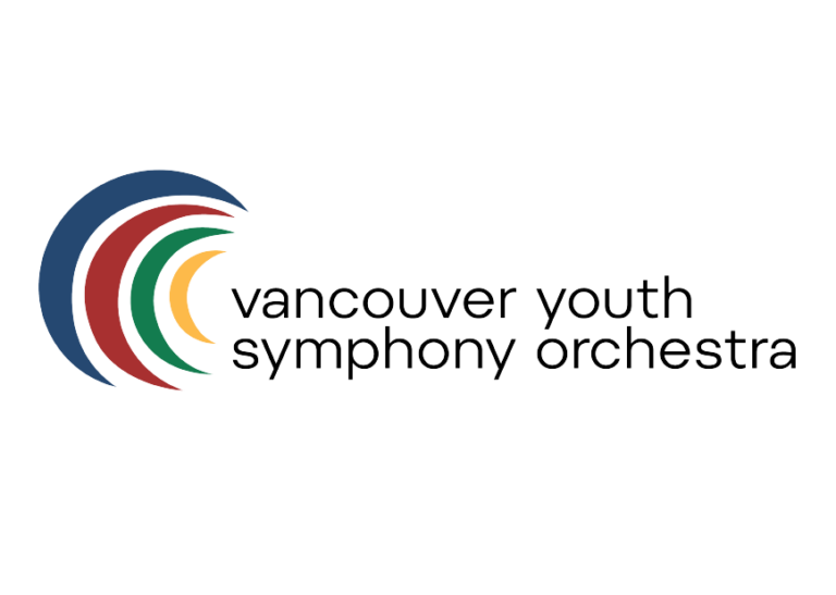
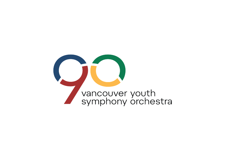
The iconography of the VYSO logo comes from the formation of an orchestra. It gives each level of the orchestra a different, unique, and equally vibrant role in the cohesive symphony. In the VYSO, their foundational teachings of music at every level are crucial to young player development, and serious commitment to musical expression and perfection happens at every age, so each level. At the same time, they grow stronger or larger, is no less important than the one preceding.
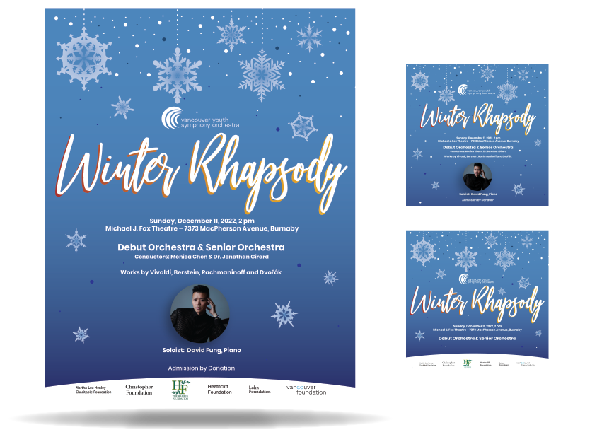
The website design process was a collaborative effort, with the VYSO team and I working together to bring the colour theory and representation to life. We aimed to strike a balance between professionalism and vibrancy, creating a palette that the students could relate to while maintaining a clean and polished look.
Solution
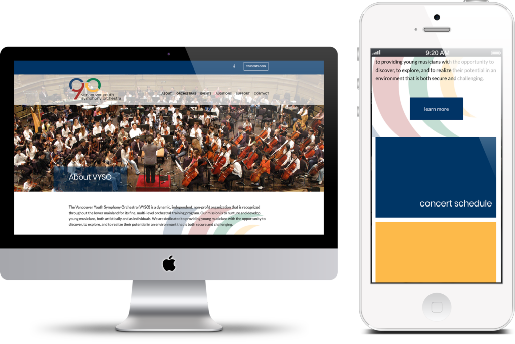
In collaboration with the VYSO, a web developer and I then worked on their long-term vision for the website. We worked with them to determine functionality that could be taken from their team and automated through their website.
I worked with them on how to authentically translate their new visual identity not only online but to all print materials going forward and how to best use their marketing budget to achieve brand awareness and conversion, both for prospective students and concert guests.
Results
The VYSO continues to be a leader in children’s extracurricular musical education in the Lower Mainland of Vancouver and is known for its excellence Canada-wide. With the elevation of its brand, work on its 90th (and upcoming 95th) year campaigns, and holistic brand identity through print and online visual materials, it is positioning itself as a forward-thinking organization.
Through the use of their online tools and infrastructure, we have alleviated a huge administrative load from the organization, allowing prospective and current students, instructors, and conductors to audition, communicate, and log work in a seamless and cost-efficient way.
Do you have a website or brand that needs a refresh, redesign, or all out strategy revamp?
Do you feel like you have the start of a brand but need the content, communications, and values-orientation expressed in an audience-focussed way? Do you know you need something, but you’re not sure what?